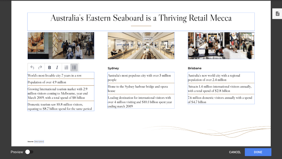
Deck-wide editing
This feature allows authorised users to edit the copy and images of a deck for all presos created from that point on. Its primary function is to remove the need for clients to commission content developers for simple stats updates or minor copy changes. This guide will go through the steps required to activate, implement and test this feature, as well as detail various gotchas to watch out for.
Deck-wide (aka. Companywide) editable works by looking for data-companywide-...
tags on DOM elements, and applying logic based on the type of tag
(see [companywide reference] in for a full list of tags). These tags
dictate how PresoManager and the app interact with editable elements,
and are the primary tool for developers in implementing Companywide
editable in a deck.
A companywide field needs to be present in the slide's index.html file for it to become editable in PresoManager. If the field needs to be added to the DOM after the slide's HTML is loaded, we can use a placeholder read-only field in the index.html then inject the editable field later. See Injecting companywide edited copy for the steps involved in this process.
Additionally, each key must be registered in the slide's editables list
in project.yaml. See Project file — editables.
Read on to learn how to set up your project for companywide editable.
Making copy editable
This guide is all about text. In here you'll learn how to make a copy element editable, a trick to deal with formatting, and a few useful CSS properties to keep your slides working properly.
Usage
Tagging an element as editable is as simple as adding an attribute to
the HTML. For copy, that attribute is data-companywide-editable. Due
to what happens in the background to make it editable, this attribute
needs to be added directly to the element that will contain the text,
like this:
<div data-companywide-editable="{key}">
	<!-- initial text here -->
</div>
Note the use of the {key} being assigned to the attribute. This is
used by the app to determine what text belongs to each element, and is
required to make the feature work. In most cases this key will be unique
across the entire deck, although it is possible for multiple elements to
use the same key (see linking for more info).
Only one companywide editable for each key can exist in the DOM at a time. If you wish to render multiple instances using the same key (eg. an editable title on the main slide, repeated as a read-only element in the header of a modal), one must be removed from the DOM before the other can be rendered.
At the simplest level, this is all that's required to make text editable using this feature. However, things become a bit more complicated when you're dealing with more complex HTML structures. Below we'll detail a few things to look out for and how to get around them.
Due to the way companywide editable works, any HTML tags inside an editable
element that are not associated to a declared rich-text option will get
stripped after you edit it. This means you can't have nested HTML inside
a companywide editable field, such as <strong> and <ul>, unless the
style and list toolbar options have been specified.
Read the formatting & rich text section below to find out more about what rich-text options are available.
Formatting & rich text

By default, an editable text area won't have any formatting options;
it'll just be a plain text box with undo and redo buttons. If you
include the data-toolbar attribute, however, and add the appropriate
values, you can define different toolbars for each text area in your
deck.
<div data-companywide-editable="{key}" data-toolbar="format style color">
	<!-- initial text here -->
</div>
Toolbar options
Include one or more of the following in the data-toolbar attribute (space separated) to customise your toolbar. Tool sets are displayed in the order you write them.
format- dropdown with block-level formats (ie. normal, heading1, monospace etc. see below about customising options)list- unordered list and ordered liststyle- Bold and Italic buttonscolor- text color selection (see below about customising options)superscript- superscript and subscript options for raised and lowered smaller textalign- horizontal text alignmentlink- "Insert/edit link" button and "Remove link" buttonremoveformat- clear format button
The order in which toolbar options are declared is the order they will be rendered in. For consistency across your content, the same order should be used for each toolbar instance you declare.
We recommend the following order:
format list style color superscript align link removeformat
Customising colours and formats, enabling spell checking
You can define the colours and block formats available for your deck by
adding the content_editors text attribute to your project.yaml file.
These options are shared by every toolbar in the deck. It's not currently possible to have different colour palettes for each text area.
companywide_editable: true
contenteditable: true
content_editors:
  text:
    spell_check: true
    colors:
      - color: "000000"
        title: "Black"
      - color: "FF0000"
        title: "Red"
      - color: "00FF00"
        title: "Blue"
      - color: "0000FF"
        title: "Green"
    formats:
      - block: "p"
        title: "Normal"
      - block: "h1"
        title: "Heading 1"
      - block: "h2"
        title: "Heading 2"
      - block: "h3"
        title: "Heading 3"
      - block: "blockquote"
        title: "Blockquote"
      - block: "pre"
        title: "Monospace"
You can define up to 25 custom colours, but formats are limited to a subset of ["p", "h1", "h2", "h3", "h4", "h5", "h6", "pre", "monospace", "blockquote"]
We recommend setting the colours list to the colour palette already used in the deck, and the formats to only those that you have defined css styles for.
Caveats
Having powerful rich-text editing means inserting and altering HTML as you type. With this in mind, There are a few things to be aware of when writing stylesheets for this content
Paragraphs vs. Line breaks
By default, line breaks are handled with a <br /> tag. If you request
block-level toolbar options ("list" and "format") each new line will
creat a new <p> tag instead.
Sanitized HTML
When HTML is pasted in from an external source, or when the textarea
first loads, we'll sanitize the contents for only those tags, styles
and attributes the editor needs (based on the toolbar). This keeps the
content free from any bugs or unintended presentation. So if you don't
add lists to your toolbar options, <li> tags will be stripped out.
Non-DIV editable fields
While any html tag can be used as an editable field with a toolbar, only
<div> tags can have the "list" or "format" options. If you attempt
to add these options, they'll be removed, and depending on the
development environment, a console error will be thrown.
We recommend only using tags such as <h3>, <p> and <div> for editable
text areas. Other HTML elements, like <li> tags, can have limited
rich-text-editing functionality.
Spell Checking
Optionally, you can add the spell_check: true flag under the text options to allow users to see spell-check warnings and context menu suggestions inside editable fields, in a style similar to a web browser.
Injecting companywide edited copy
Companywide fields will self-manage if they are declared in the HTML of a
slide, but doing that isn't always feasible.
Because injecting HTML is relatively common in the
sliderendered or slideready events, we have a step-by-step
process below for when you want to make one of these injected
elements companywide editable. This process makes use of
Bridge.Companywide,
so make sure you check it out before continuing.
Step 1 - Create a read-only element in the HTML
The first step is to create a read-only element in the HTML. It will have the same companywide data tag and data key that we will use in our injected field later. This field should be hidden from the user and will remain read-only throughout this process.
Example read-only fields:
<div data-companywide-editable="cwe-text" data-readonly></div>
<div data-companywide-dynamic-image="cwe-image" data-readonly></div>
<div data-companywide-youtube-player="cwe-youtube" data-readonly></div>
Step 2 - Inject our editable field into the DOM
We can use JavaScript to inject a field during the sliderendered or slideready
events, or later as a result of user interaction. Our injected field must have
the same data tag and key as our read-only field from the previous step.
If the user is editing the slide in PresoManager, this field will automatically
become editable and it will be given a value if one exists for its data key.
// Read-only field in index.html hidden by CSS
<div data-companywide-editable="cwe-text" data-readonly></div>
... // Editable field injected later with JS
<div data-companywide-editable="cwe-text">Field value</div>
Step 3 - Retrieve the Companywide values using Bridge
When the slide is loaded outside of PresoManager's edit mode, the injected fields will
not be populated automatically. We need to retrieve their saved values and pass them
into our injected elements.
For that, we can take our field's data key and use Bridge.Companywide.get(key).
If a saved value exists, it will be returned in this format:
// Bridge.Companywide.get(key)
[
	{
		created_date: string,
		deck: string,
		id: number,
		key: string,
		mime: string,
		modified_date: string,
		scope: string,
		team: number,
		url: string,
		user: string,
		value: string,
	},
];
We can ignore everything other than the value property. The value will be the data
that the user has entered in the field in PresoManager's edit mode. All we need to do now
is pass the value to our injected element.
Bridge.Companywide.get(key) will always return the latest value for the key's field,
even while the user is editing the field. If there is no value for the provided key, either
because the key doesn't have a corresponding field or because the user hasn't modified the
field in PresoManager yet, Bridge.Companywide.get(key) will return undefined. It is
recommended that a default value be provided along with the key to make it easier to handle
the instances where no value is returned.
E.g.
var defaultValue = {
	value: "Placeholder",
};

var companywideValue = Bridge.Companywide.get(key, defaultValue);

// Now we can use companywideValue.value without checking whether companywideValue exists
var value = companywideValue.value;
Here's an example of what a finished product might end up looking like:
<article id="slide_id">
	<section class="content">
		<section class="content-body">
			<div data-companywide-editable="editable_key" data-readonly></div>
			<div class="container"></div>
		</section>
	</section>
</article>

<script type="text/javascript">
	$("#slide_id").on("sliderendered", function () {
		var $pageContainer = $("#slide_id");

		$pageContainer.on("slideready", function () {
			var myKey = "editable_key"; // same key we assigned to 'data-companywide-editable' in the HTML
			var cweValue = Bridge.Companywide.get(myKey, { value: "Hello!" });

			var $callout = $(
				'<div class="callout" data-companywide-editable="editable_key"></div>',
			);
			$callout.text(calloutCWE.value);
			$(".container", $pageContainer).append($callout);
		});
	});
</script>
The output:
<article id="slide_id">
	<section class="content">
		<section class="content-body">
			<div data-companywide-editable="editable_key" data-readonly></div>
			<div class="container">
				<div class="callout" data-companywide-editable="editable_key">
					Hello!
				</div>
			</div>
		</section>
	</section>
</article>
Styling & layout
There are a few styling and layout properties that become much more important once something is editable. Allowing users to alter the content of a slide can be a messy business, and we need to tread the line between letting users do what they want and giving them so much freedom that things start breaking. The main purpose of this feature is to let clients take care of minor copy changes and stats updates, so as a general rule users should not be able to drastically alter or break the layout of a slide by making copy changes. There's a certain amount of user responsibility for ensuring that copy changes look appealing, so as long as the user can't break the slide they should have the freedom to do as they please. There's no one way to achieve this, but a few useful CSS properties to keep in mind are:
- min-width / max-width
- min-height / max-height
- position: absolute / relative
Note that width and height properties can't be set on inline CSS
elements. We recommend making your text fields display:block or
display:inline-block
User feedback
To help communicate a slide's design limitations to the user, we have made the following tags available:
data-warn-on-overflow
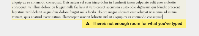
By specifying an element's height/max-height and adding the tag
data-warn-on-overflow, the user will be shown the warning message
"there's not enough room for what you've typed" if the copy they
have entered overflows the field.
data-scrollup-on-blur
When a height/max-height has been applied to an editable text area the text within will scroll to keep the up with the user's text cursor. This can give the wrong impression to users, as subsequent visits to the slide will have the text area scrolled to the top again. Tagging the field with this attribute helps to better demonstrate the final design as it will automatically scroll the text back to the top as soon as the user clicks out of the field.
Next up, we'll tackle making images editable!
Making images editable
In this guide we go over how to make an image editable, the different types of editable images and how to make the best use of them.
Usage
Much like an editable text field, to tag an editable image you just add
the data-companywide-dynamic-image attribute and assign it an ID. For
example:
<div class="image" data-companywide-dynamic-image="{key}"></div>
This will assign new images using the background-image CSS property,
so the old image will be overridden by the new one. It will keep any
other styles applied to it by the slide/global CSS, so use that to
decide how the image should behave.
For example, you have an editable image that is the background of a
section of the slide, so you need it to always cover the entire section.
In this case, you would set the background-size property to cover to
ensure that any added images stretch to fill the space.
As with companywide editable text, only one companywide dynamic image for each key can exist in the DOM at a time.
The data-img attribute
By default, data-companywide-dynamic-image adds new images as a
background-image of the element, so each time a new image is uploaded
the old one is overridden. However, you can also have new images added
as the source of individual <img> elements, which get appended to the
tagged element. Used like this, the tagged element becomes more of an
image container. All you need to do is add data-img to the attributes
of the editable element:
<div
	class="image-container"
	data-companywide-dynamic-image="{key}"
	data-img
></div>
Which results in the following when an image is added:
<div class="image-container" data-companywide-dynamic-image="{key}" data-img>
	<img src="imgURL_1" alt="" />
</div>
That's it for images! Next up are editable videos.
Embedding YouTube videos
When people think of finding a video online, they think of YouTube. We've made a handy little shortcut to let developers, as well as marketing managers and content owners, easily embed any YouTube video.
Note that this is not just a YouTube Player, but a way for users to add/change YouTube videos themselves, in the same manner they can edit text or images.
Why YouTube?
We use YouTube to drive our editable videos as their API gives us control over video playback and settings where we need it. For example, pausing and restarting a video when the user opens and closes the slide overlay mid-presentation.
Usage
Similar to the editable text and image fields, add the
data-companywide-youtube-player attribute to your chosen element and
assign it a key. This element will become a wrapper for the YouTube
iFrame that is loaded by the component.
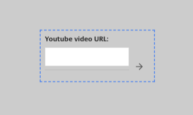
<div data-companywide-youtube-player="{key}"></div>
When viewed in the CDK and LivePreso, it'll look something like this:
Accepted inputs
When in use, the video component accepts the following inputs:
- YouTube video IDs
- YouTube URLs
Styling & layout
When you first add the widget, the YouTube player may appear too small or have the wrong aspect ratio. Every deck will have different requirements, so we've left the styling up to you.
If you're having trouble getting the video to display how you want consistently, here are some tips:
- You'll want to add styles to both
.youtube-widgetas well as its containediframe. - Setting a fixed size, rather than a flex or percentage-based size, is recommended.
- Remember that LivePreso loads one slide before and after the one you're currently looking at, so be aware that any video rendering code could run prematurely.
Templates
One of the best ways to use this feature is with Templates! create a "YouTube Video" template, and your users can insert a slide with a YouTube video anywhere they like in a deck. See the Building templates guide for more info.
Now you have it! An editable YouTube video component that can be used in both Companywide editable slides and Templates.
Read on to learn all about how to link two or more editable elements together.
Utilities
This section contains information about several helper features available to assist in development and enhance the user experience.
Edit mode
This is a class that gets added to the body when a user opens a slide
in PresoManager, similar to other modes that get added (see the
preso modes overview). We can use it to apply
edit-mode specific logic and styles that we only want to show while a
user is editing a slide.
Here's what it looks like:
<body class="edit-mode">
	<!-- LivePreso -->
</body>
And here's how you would reference it in the slide:
$("#slide_id").on("sliderendered", function () {
	var isEditMode = $("body").hasClass("edit-mode");
	if (isEditMode) {
		// functionality when in edit-mode
	} else {
		// normal functionality
	}
});
.edit-mode #slideshow article#slide_id {
	/* classes to apply in edit-mode */
}
Some common uses for this class are:
- Adding
edit-modespecific styles to the CSS/SCSS - Populating the slide with dummy data to show the user a real representation of what the slide will look like in prep/present mode
- Adding a toggle/dropdown to the slide to allow the user to freely access different states of the slide.
See the use-case example discussed in the PresoManager overview for more detail on the toggle/dropdown example.
If you decide to add some sort of toggle or other interactive device to a slide, you'll need to make sure it's active in PresoManager. Find out how in Interactive elements in PresoManager below.
Interactive elements in PresoManager
Since the user needs to be able to click on all the editable elements to edit them, we disable all pointer events on the slide in PresoManager. This ensures that the user won't accidentally activate anything while trying to edit it, and because generally speaking the user won't need to access the general functionality of the slide while editing it.
This causes a bit of a problem when we need the user to be able to
interact with something on the slide, so we have an attribute that you
can add to anything that needs to keep its pointer events in
PresoManager: data-companywide-interactive.
Here's how you might use it with an edit-mode toggle:
<div class="edit-mode-toggle" data-companywide-interactive></div>
Be careful how you use this attribute! If you put it on the parent of an editable element or on something that's too close to an editable element, it will be hard for the user to click on it!
Developer Tools
To save time during development, there's a key generator script that
you can use to add the ="{key}" part of the data-companywide-..
attribute. Once you've added the attribute to everything you want to
make editable, just run the script and it will find everything tagged as
data-companywide-editable or data-companywide-dynamic-image that
doesn't have a key already and add one. These keys use the slide's ID
with a short randomly generated string at the end.
For anything you want to link together, you'll need to manually add the keys so that they are the same. See linking for more info.
You can find the slide tools at <https://www.npmjs.com/package/@salespreso/slide-tools\>