Fieldsets Hook
Related links:
Fieldsets are a way to generate context for a preso. This can be either purely from data from preso creation, fields added to the preso create/edit screen, or a combination of both.
Installing fieldsets
In your hooks folder, (usually src/js/hooks/) create the file
fieldsets.js:
export default function (options) {
	const { Fieldset } = options;

	return new Fieldset({});
}
In your hooks file, (usually src/js/hooks.js) add to your interface:
import Fieldsets from "./hooks/fieldsets.js";

export default {
	fieldsets: Fieldsets,
};
Events
These events are accessible as a function separately for each field, and as a global event for the fieldsets interface. These events are the following:
| Event | Description |
|---|---|
| onLoad(options) | Called when fieldsets are first loaded |
| onBeforeChange(options) | Called when a field has changed, before onChange is called. Can be used to show a warning modal. |
| onChange(options) | Called when a field has changed. If used on a field, is called only when that field has changed. If globally it is called when any field changed. |
| onCustomersChange(options) | Called when a customer or a contact has been added or removed |
| onValidate(options) | Called just before onSave. When errors are returned, it will interrupt the saving process and display errors |
| onSave(options) | Called when the save button has been pressed |
onLoad example:
{
  // ...
  onLoad({ set, context, data, state, fields, value }) {
      return {
          // Declares that context has changes
          context: {},
          // Declares that a particular field state has changed
          state: {}
      };
  }
}
onBeforeChange example:
{
  // ...
  onBeforeChange({ set, context, data, state, fields, value }) {
	if (value) {
		return {
			warning: {
				// The title of the warning modal
				title: "Field is changing"
				// The (required) message to show in the warning modal
				message: "Are you sure you want to make this change?"
				// Alternate text to show on the cancel button
				cancelButtonText: "No",
				// Alternate text to show on the continue button
				continueButtonText: "Yes"
			}
		}
	}
  }
}
onChange example:
{
  // ...
  onChange({ set, context, data, state, fields, value }) {
      return {
          // Declares that context has changes
          context: {},
          // Declares that a particular field state has changed
          state: {}
      };
  }
}
onCustomersChange example:
{
  // ...
  onCustomersChange({ set, context, data, state, fields }) {
      return {
          // Declares that context has changes
          context: {},
          // Declares that a particular field state has changed
          state: {}
      };
  }
}
onValidate example:
{
  // ...
  onValidate({ set, context, fields, data, state, value, errors }) {
      return {
          // Declares that there are errors during validation
          errors: []
      };
  }
}
onSave example:
{
  // ...
  onSave({ set, context, data, state, fields, value }) {
      return {
          // Declares that context has changes
          context: {},
          // Return an error in onSave will force the validation
          // step and delete the appointment.
          errors: {
              key: ["i am an error"]
          }
      };
  }
}
Options
Each event is passed an object of values that can be used to set
context or change state. The keys are the same between global and
field events, save an extra value key added to each field's options,
which is the current outputted value of that field at the time the
event is called.
export default function (options) {
	const { Fieldset, Input } = options;

	return new Fieldset({
		fields: [
			new Input({
				name: "test",
				label: "Test",
				onChange({ set, context, fields, state, data, customers, value }) {
					// Called on this particular input's change
					// ...
				},
			}),
		],
		onChange({ set, context, fields, state, data, customers }) {
			// Called on any field change
			// ...
		},
	});
}
set
A function that can be used to dynamically update fieldsets throughout the different events.
This method can be used to update either state or errors. Generally its main use is to
change the visibility, disabled or loading state of various fields - but it can otherwise be
used in the same way you would use it when returning state/errors in a global function.
It can be used in all events, both global and local.
{
	onCustomersChange({ set }) {
		// This fires -immediately-. These states will apply.
		set({
			errors: {
				mySelect: ["For some reason there's an error"]
			},
			state: {
				myInput: { disabled: true, loading: true }
			}
		});

		// After 1 second, we set the state back to how it was
		return Promise.delay(1000).resolve({
			state: {
				myInput: { disabled: false, loading: false }
			}
		});
	}
}
context
Contains the context at the point of the event. This will by default only
contain a fields key, containing values from fields. You can
understand the outputs here by viewing the "context" tab when
working on hooks.
fields
Shortcut access to the same values as context.fields, which is
the values selected by fields.
state
Current state of all fields, includes value, label, disabled and any additional state information relevant to that particular field type (eg. data and chips when working with a Token field).
data
Contains useful general data from preso creation/editing process that you may need within your context, data from the server, user information, preso data, etc.
data.appointment
Available in all events. Will be null in all steps except onSave unless you
are editing an existing appointment.
{
	"adjunctSections": [],
	"adjunctSlides": [],
	"adjunctSubSlides": [],
	"appointmentssection_set": [],
	"appointmentsslide_set": [],
	"attendees": "",
	"begin": "2017-07-11T06:05:29.000000Z",
	"bookmarks": [],
	"contact_set": [
		{
			"customer": "https://demo-server.salespreso.com/api/customers/1/",
			"email": "john.smith@testcustomer.com",
			"fullName": "John Smith",
			"id": 1,
			"name_first": "John",
			"name_last": "Smith",
			"notes": "Skinny latte with one sugar",
			"opportunity_set": [],
			"phone": "0400 000 000",
			"photo_128": null,
			"photo_256": null,
			"photo_512": null,
			"position": "CEO",
			"url": "https://demo-server.salespreso.com/api/contacts/1/",
			"user": null
		}
	],
	"created_by_support": false,
	"created_date": "2017-07-11T06:06:40.000000Z",
	"creation_status": "ready",
	"deckversion_set": [],
	"display_contacts": "John Smith",
	"display_title": "Test customer",
	"end": "2017-07-11T07:05:29.000000Z",
	"id": 1,
	"latest_snapshot": {
		"id": 1,
		"url": "https://demo-server.salespreso.com/api/snapshots/1/"
	},
	"latest_tele": {
		"url": "https://demo-server.salespreso.com/api/hostedpresos/"
	},
	"modified_date": "2017-07-11T06:06:40.000000Z",
	"opportunity_set": [
		{
			"appointment_set": [],
			"contact_set": [],
			"customer": "https://demo-server.salespreso.com/api/customers/1/",
			"id": 1,
			"is_default": false,
			"name": "Happiness opportunity",
			"profile": {
				"cost": 1200,
				"product": "premium"
			},
			"soft_deleted": false,
			"stage_name": "Proposal accepted",
			"url": "https://demo-server.salespreso.com/api/opportunities/1/"
		}
	],
	"preset": null,
	"sort_date": "2017-07-11T06:06:40.000000Z",
	"support_mode": false,
	"url": "https://demo-server.salespreso.com/api/appointments/1/",
	"user": {
		"actions": [],
		"email": "jane.doe@example.com",
		"first_name": "Jane",
		"fullName": "Jane Doe",
		"groups": [],
		"id": 1,
		"is_support": false,
		"last_name": "Doe",
		"permissions": {
			"appointments": {
				"canUploadCustomSlides": false,
				"isContentAdmin": false,
				"livePresenter": false,
				"telePresenter": false
			},
			"presets": {
				"canCreateCompanyPresets": false
			},
			"tempslides": {
				"canModifyTemporarySlides": false
			}
		},
		"preferences": {
			"app_prefs": {},
			"email_signature": "",
			"notification_sender": "default",
			"timezone": ""
		},
		"url": "https://demo-server.salespreso.com/api/users/1/",
		"username": "jane.doe"
	},
	"viewtype": "live"
}
data.appointment.preset
Available in all events.
If a preset is selected at preso creation,
the following data will be available - otherwise, data.appointment.preset
will be null.
{
	"id": 7,
	"scope": "user",
	"keylist": [
		{
			"key": "",
			"visible": true
		},
		{
			"key": "why",
			"visible": true
		},
		{
			"key": "why/time",
			"visible": true
		},
		{
			"key": "why/sophistication",
			"visible": true
		},
		{
			"key": "how",
			"visible": true
		},
		{
			"key": "how/interaction_channel",
			"visible": true
		}
	],
	"created_date": "2017-01-20T04:40:14.844000Z",
	"modified_date": "2018-01-15T22:22:24.228000Z",
	"name": "Why and How",
	"context": {},
	"user": "https://server.livepreso.com/api/users/6/",
	"deck": "https://server.livepreso.com/api/decks/3/",
	"url": "https://server.livepreso.com/api/presets/7/"
}
Preset data is only fetched in the fieldsets hook, for all other hooks (selections, selection rules etc.) the preset URL is returned. If you require this information outside of fieldsets, we recommend saving it to the context.
data.customers
Available in onSave.
A list of the customers associated with the preso.
[
	{
		"contact_set": [
			"https://demo-server.salespreso.com/api/contacts/1/",
			"https://demo-server.salespreso.com/api/contacts/2/"
		],
		"default_location": null,
		"default_opportunity": "https://demo-server.salespreso.com/api/opportunities/0/",
		"id": 1,
		"logo": "file:///Users/user/Desktop/awesome_logo.jpg",
		"logo_128": "file:///Users/user/Desktop/awesome_logo.jpg",
		"logo_256": "file:///Users/user/Desktop/awesome_logo.jpg",
		"logo_512": "file:///Users/user/Desktop/awesome_logo.jpg",
		"logo_original": "file:///Users/user/Desktop/awesome_logo.jpg",
		"notes": "Really awesome customer",
		"opportunity_set": [
			{
				"appointment_set": [],
				"contact_set": [],
				"customer": null,
				"id": 0,
				"is_default": true,
				"name": "__default__",
				"profile": null,
				"soft_deleted": false,
				"stage_name": "",
				"url": "https://demo-server.salespreso.com/api/opportunities/0/"
			},
			{
				"appointment_set": [],
				"contact_set": [],
				"customer": null,
				"id": 1,
				"is_default": false,
				"name": "Happiness opportunity",
				"profile": {
					"cost": 1200,
					"product": "premium"
				},
				"soft_deleted": false,
				"stage_name": "Proposal accepted",
				"url": "https://demo-server.salespreso.com/api/opportunities/1/"
			},
			{
				"appointment_set": [],
				"contact_set": [],
				"customer": null,
				"id": 2,
				"is_default": false,
				"name": "Mediocre opportunity",
				"profile": {
					"cost": 800,
					"product": "entry level"
				},
				"soft_deleted": false,
				"stage_name": "Proposal pending",
				"url": "https://demo-server.salespreso.com/api/opportunities/2/"
			}
		],
		"primaryColour": "#0098ff",
		"primary_colour": "#0098ff",
		"profile": {
			"awesomeness": 100,
			"product_level": "premium"
		},
		"soft_deleted": false,
		"title": "Test customer",
		"url": "https://demo-server.salespreso.com/api/customers/1/"
	}
]
data.contacts
Available in onSave.
[
	{
		"customer": "https://demo-server.salespreso.com/api/customers/1/",
		"email": "john.smith@testcustomer.com",
		"fullName": "John Smith",
		"id": 1,
		"name_first": "John",
		"name_last": "Smith",
		"notes": "Skinny latte with one sugar",
		"opportunity_set": [],
		"phone": "0400 000 000",
		"photo_128": null,
		"photo_256": null,
		"photo_512": null,
		"position": "CEO",
		"url": "https://demo-server.salespreso.com/api/contacts/1/",
		"user": null
	}
]
data.headers
Available in all events.
Contains headers (token and api version) required when interacting with LivePreso API.
data.initialContext
Available in all events.
When editing an appointment, this will contain the context on initial load, and is unaffected by edits.
data.isNewAppointment
Available in all events.
Boolean that is true if the appointment is new.
data.urls
Available in all events.
Contains endpoints that may be necessary to interact with the LivePreso API.
data.user
Available in all events.
Details about the owner of the preso.
{
	"actions": [],
	"email": "jane.doe@example.com",
	"first_name": "Jane",
	"fullName": "Jane Doe",
	"groups": [],
	"id": 1,
	"is_support": false,
	"last_name": "Doe",
	"permissions": {
		"appointments": {
			"canUploadCustomSlides": false,
			"isContentAdmin": false,
			"livePresenter": false,
			"telePresenter": false
		},
		"presets": {
			"canCreateCompanyPresets": false
		},
		"tempslides": {
			"canModifyTemporarySlides": false
		}
	},
	"preferences": {
		"app_prefs": {},
		"email_signature": "",
		"notification_sender": "default",
		"timezone": ""
	},
	"url": "https://demo-server.salespreso.com/api/users/1/",
	"username": "jane.doe"
}
state
Available in all events.
State dictates how the fieldsets look (and is implemented directly
in the application). The CDK has a state tab that can be used to
see the current state at any time.
value
Available in all field events only.
Although fields can be used to do the same thing, value is a
shortcut to that field's field value.
Modification
Events have little use by themselves if they can't accomplish actual
changes for the fieldset or the eventual created presentation. Therefore
for each event, it's possible to modify the context and state for
your presentation, and errors when validating.
Any modification is done inside the event by returning an object with a key for the type of change you wish to make.
context
Available in events: onLoad, onSave, onChange
export default function (options) {
	const { Fieldset, Input } = options;

	return new Fieldset({
		onLoad() {
			return {
				context: {
					foo: "bar",
				},
			};
		},
	});
}
The above would merge its values into the already existing context,
and only replace it if the key foo already existed.
state
Available in events: onLoad, onChange
State changes are done in an identical way, though you must be careful
not to change it in an incompatible way that the CDK or UI v2 can't
handle. The CDK is a great tool to use to see existing state in the
state tab to make changes. Using state in this way could allow for
anything such as loading selections or token data on initialization,
disabling fields based on changes, etc.
Using the following fieldset example:
export default function (options) {
	const { Fieldset, Select } = options;

	return new Fieldset({
		fields: [
			new Select({
				name: "animals",
				label: "Animals",
				options: [
					{ value: "cat", label: "Cat" },
					{ value: "dog", label: "Dog" },
				],
			}),
		],
	});
}
The following state would be generated:
{
	"fields": {
		"animals": {
			"selectedValue": "cat",
			"options": [
				{
					"value": "cat",
					"label": "Cat"
				},
				{
					"value": "dog",
					"label": "Dog"
				}
			],
			"label": "Animals",
			"disabled": false,
			"name": "animals",
			"value": "cat",
			"type": "select",
			"multiple": false,
			"description": null,
			"optional": false
		}
	},
	"errors": {}
}
You could modify the options in this example by returning something like the following in an event:
return {
	state: {
		selectedValue: "duck",
		animals: {
			options: [
				{ value: "cow", label: "Cow" },
				{ value: "duck", label: "Duck" },
			],
		},
	},
};
errors
Available in events: onValidate
This response will be slightly different between a global event and a per field event.
For a field, an array of strings can be returned indicating error messages for that field. It will automatically apply to that field.
Field onValidate:
return {
	errors: ["Error message 1", "Error message 2"],
};
For the global event, you need to specify the name of the field. For the
above animals example:
Global onValidate:
return {
	errors: {
		animals: ["Error message 1", "Error message 2"],
	},
};
Asynchronous tasks
Note that for asynchronous tasks, you can return the object of changes in a Promise:
export default function (options) {
	const { Fieldset, Input, Promise } = options;

	return new Fieldset({
		onLoad() {
			return Promise.resolve({
				context: {
					foo: "bar",
				},
			});
		},
	});
}
For more information on the Promise library used, see:
https://github.com/KyleAMathews/superagent-bluebird-promise
Or for promises in general:
https://developer.mozilla.org/en/docs/Web/JavaScript/Reference/Global_Objects/Promise
Note that the Promise must be included from the options at the top of the fieldsets factory.
Warning modal
Changing a fieldset can sometimes cause data previously entered by the
user to be discarded. When you want to warn the user when they are making
a change, you can show a modal with a message to inform the user about
the consequences of their change and ask whether they want to continue.
If the user chooses the "Cancel" option, their field change will be
reverted or prevented and the onChange event will not trigger. If the
user selects the "Continue" option, the onChange event will be triggered
and the field's changes will processed as usual.
Available in events: onBeforeChange
export default function (options) {
	const { Fieldset, Token } = options;

	return new Fieldset({
		fields: [
			new Token({
				name: "modalTokenTest",
				data: [
					{ label: "Alpha", value: "a" },
					{ label: "Beta", value: "b" },
					{ label: "Delta", value: "d" },
				],
				onLoad() {
					window.modalTokenTestCount = 0;
				},
				onBeforeChange(opts) {
					// Show the modal when removing a chip
					if (window.modalTokenTestCount > opts.value.length) {
						return {
							warning: {
								title: "Tokens",
								message: "I see that you are deleting a token. Are you sure?",
								cancelButtonText: "No",
								continueButtonText: "Yes",
							},
						};
					}
				},
				onChange({ value }) {
					// Set the token count to be the current number of chips
					window.modalTokenTestCount = value.length;
				},
			}),
		],
	});
}

| Parameter | Type | Description |
|---|---|---|
| message | String | (required) The message shown in the modal |
| title | String | The modal's title |
| cancelButtonText | String | Alternate text to show on the Cancel button |
| continueButtonText | String | Alternate text to show on the Continue button |
Fields
Fields are added in the fields property.
export default function (options) {
	const { Fieldset } = options;

	return new Fieldset({
		fields: [
			// Instantiate fields here
		],
	});
}
BaseField
| Parameter | Type | Description |
|---|---|---|
| name | String | (required) Name of the field. This is how you would interact with the field in events, and how it's named in the fields context |
| label | String | Text label shown above the field |
| description | String | Text description shown beneath the field. Supports some HTML (see here for full list) |
| visible | Boolean | Defaults to true. Determines whether the field is shown |
| loading | Boolean | Defaults to false. Displays a loading symbol, but doesn't prevent interaction by itself. |
| disabled | Boolean | Defaults to false. Set to true to prevent the user from interacting with the field |
| optional | Boolean | Defaults to false. Set to true if field is not required |
| onLoad | Function | Event called when the field is first loaded |
| onChange | Function | Event called when the field being changed |
| onCustomersChange | Function | Event called when a customer or contact is added/removed |
| onValidate | Function | Event called when the field is being validated |
| onSave | Function | Event called when the field is being saved |
The BaseField is not useful by itself, but the inputs to follow
inherit from it. Use this to understand the values and methods you have
available by default.
Button
extends BaseField
Buttons can be used to fetch new data using input values, clear all fields etc.
| Parameter | Type | Description |
|---|---|---|
| value | String | The name on the button. Not to be confused with label, which is above the field |
| onClick | Function | Event called when the button has been clicked. Works exactly like onChange in terms of input and output, just a more reasonable callback name |
export default function (options) {
	const { Fieldset, Button } = options;

	return new Fieldset({
		fields: [
			new Button({
				name: "click_me",
				value: "Click me!",
				onClick({ state }) {
					return {
						state: {
							click_me: {
								// Disable the button on click
								disabled: true,
							},
						},
					};
				},
			}),
		],
	});
}
Checkbox
extends BaseField
The Checkbox allows for a single, or multiple checkboxes to be selected.
| Parameter | Type | Description |
|---|---|---|
| options | Object[] | Optional list of checkbox items - this can be used to set a default select value, or have multiple checkboxes under one label |
Single checkbox:
export default function (options) {
	const { Fieldset, Checkbox } = options;

	return new Fieldset({
		fields: [
			new Checkbox({
				label: "Single checkbox",
				name: "my_checkbox",
			}),
		],
	});
}
Multiple checkboxes:
export default function(options) {
  const {Fieldset, Checkbox} = options;
>
  return new Fieldset({
    fields: [
      new Checkbox({
        label: "Multiple items",
        name: "checkbox_items",
        options: [
          { label: "Checkbox 1", default: false },
          { label: "Checkbox 2", default: true },
          { label: "Checkbox 3", default: false },
        ]
      })
    ]
  });
}
Checkboxes look like the following, as a single checkbox:

As multiple:

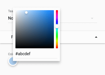
ColorPicker
extends BaseField
The ColorPicker class is used to pick a colour.
export default function (options) {
	const { Fieldset, ColorPicker } = options;

	return new Fieldset({
		fields: [
			new ColorPicker({
				label: "Brand colour",
				name: "brand_colour",
			}),
		],
	});
}

Color picker active:
DatePicker
extends BaseField
The DatePicker class is used to pick a calendar date.
| Parameter | Type | Description |
|---|---|---|
| minDate | Date | The minimum date to allow to be picked. Defaults to the start of the previous year |
| maxDate | Date | The maximum date to allow to be picked. Defaults to the end of the next year |
export default function (options) {
	const { Fieldset, DatePicker, moment } = options;

	return new Fieldset({
		fields: [
			new DatePicker({
				label: "Date of birth",
				name: "dateOfBirth",
				minDate: moment().subtract(120, "years").format(),
				maxDate: moment().format(),
			}),
		],
	});
}

Date picker opens in a modal:

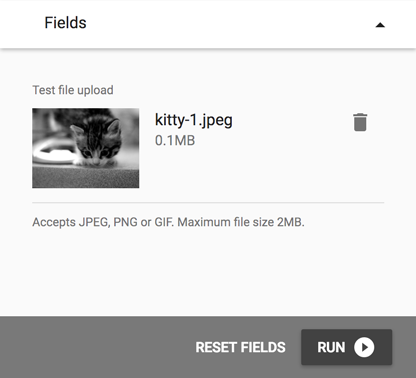
FileUpload
extends BaseField
The FileUpload class allows files to be uploaded to the be used by the deck. For example a salesperson could upload a pdf which could then be downloaded by the person viewing the presentation.
| Parameter | Type | Description |
|---|---|---|
| disabled | Boolean | If set to true, disables the input |
| maxFiles | Number | Maximum number of files you can upload |
| maxFileSize | Number | Maximum size of file (in kb) |
| allowedTypes | String[] | Allowed mimetypes for file upload |
| files | Objects[] | Initial file objects on page load. Useful to set if viewing an edited preso with an image |
export default function (options) {
	const { Fieldset, FileUpload } = options;

	return new Fieldset({
		fields: [
			new FileUpload({
				name: "testFileUpload",
				label: "Test File Upload",
				// Allows any file at all
				allowedTypes: ["application/octet-stream"],
				maxFiles: 2,
				files: [
					{
						name: "Lorem pixel",
						preview: "http://lorempixel.com/400/200",
						size: 107,
					},
				],
			}),
		],
	});
}
You can get the current file(s) in the onSave() function under value, which will
be a list of file objects.
You can check each file for the value isSaved to check if it's already been uploaded (ie, we're editing the appointment)
so as not to attempt to save it again.
onSave: function ({ value }) {
	const [file] = value;

	if (file.isSaved) {
		// We've already uploaded this file, so do nothing
		return {};
	}

	// ... Attempt save here
}
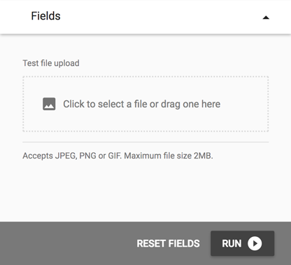
File upload with preview image:
Group
extends BaseField
A Group allows you to present a collection of fields within a visually defined group. This can be useful to define multiple fields as having a direct relationship with one another.
For example, you may wish to group several fields together that affect each other, such as a Select that filters the available search results of a Token field.
| Parameter | Type | Description |
|---|---|---|
| fields | BaseField[] | A list of fields, used exactly in the same way as when creating a new Fieldset() |
export default function (options) {
	const { Fieldset, Select, Token, Group } = options;

	return new Fieldset({
		fields: [
			new Group({
				name: "major",
				label: "Major retailers",
				fields: [
					new Select({
						name: "category",
						label: "Category",
						options: [
							{ label: "Fashion", value: "fashion" },
							{ label: "Sport", value: "sport" },
						],
					}),
					new Token({
						name: "retailers",
						label: "Retailers",
					}),
				],
			}),
		],
	});
}
Fields of a Group are prefixed by the group name. In the above example, the two inputs will be named "major_category" and "major_retailers".
Setting this field to disabled will disable all fields inside. Setting
the field to loading will replace the fields with a loader.

Hidden
extends BaseField
The sole purpose of the Hidden field is as a placeholder for showing a description or validation errors wherever you place it. A good example is if there is no fields at all, but you wish to show error messages for some other purpose.
export default function (options) {
	const { Fieldset, Hidden } = options;

	return new Fieldset({
		fields: [
			new Hidden({
				name: "testFileUpload",
				description:
					"<h2>A heading</h2><p>This text will <strong>always</strong> be shown.</p>",
				onValidate() {
					return {
						errors: ["I will always show errors on save."],
					};
				},
			}),
		],
	});
}
You can add labels, errors, loaders and descriptions to a hidden field - one or many. The only thing you can't do is try and disable it!
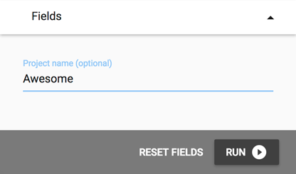
Input
extends BaseField
The Input class is an html text input.
export default function (options) {
	const { Fieldset, Input } = options;

	return new Fieldset({
		fields: [
			new Input({
				name: "project_name",
				label: "Project name",
			}),
		],
	});
}
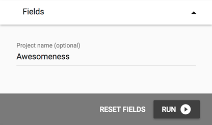
The above code will show up as the following in the application:
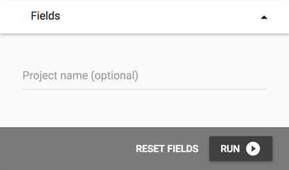
Active state:
Completed state:
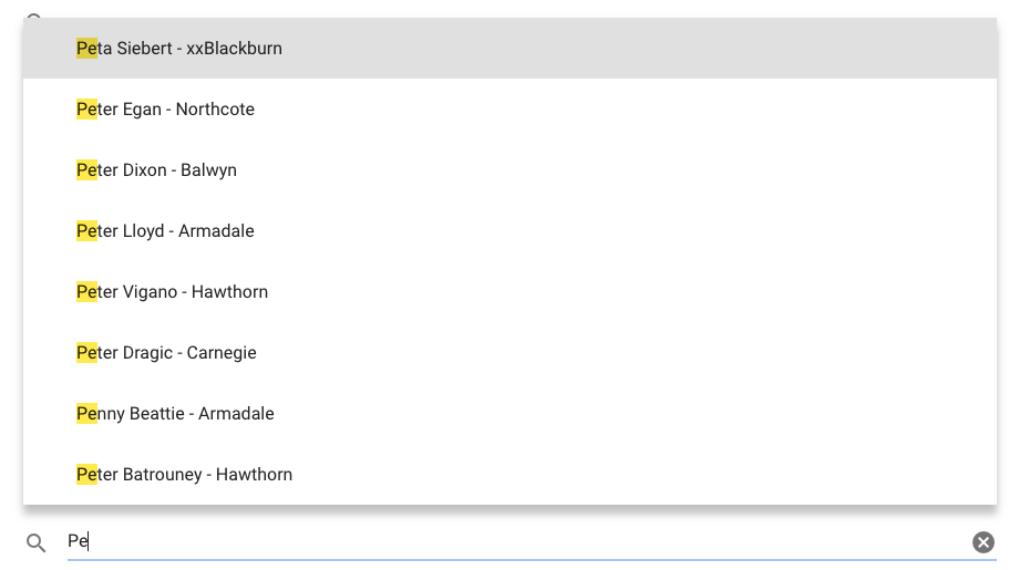
OrderableList
extends BaseField
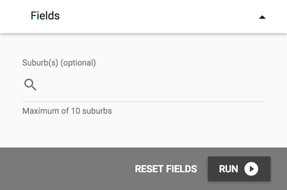
The OrderableList is an autocomplete search input that generates an orderable list. The data can be searched directly or is often the results of an api endpoint.
If you know that data will have a small number of items,
you can set the minimumChars to 0 to trigger the select dropdown
as soon as the search field is focused.
| Parameter | Type | Description |
|---|---|---|
| value | String | Initial value of the input search. Defaults to "". |
| data | Object[] | Available list items in the searchable pool |
| listItems | Object[] | Selected list items to be ordered |
| maxItems | Number | The maximum number of items allowed to be selected. -1 for infinite, which is the default |
| minimumChars | Number | The minimum characters needed to be entered before results will be shown. Default is 1 |
export default function (options) {
	const { Fieldset, OrderableList } = options;

	return new Fieldset({
		fields: [
			new OrderableList({
				name: "services",
				label: "Select services to present",
				maxItems: 2,
				data: [
					{ label: "Car wash", value: "car_wash" },
					{ label: "Detailing", value: "detailing" },
					{ label: "Cut & Polish", value: "cut_polish" },
				],
				listItems: [
					{ label: "Detailing", value: "detailing" },
					{ label: "Car wash", value: "car_wash" },
				],
			}),
		],
	});
}
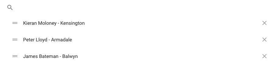
An orderable list input would look something like the following:

Search dropdown:
Selected items:
Row
extends BaseField
A Row allows placing fields next to each other, giving an equal portion of the fieldsets width to each field in the row. This can be useful if you have fields that are related to each other in some way.
| Parameter | Type | Description |
|---|---|---|
| fields | BaseField[] | A list of fields, used exactly in the same way as when creating a new Fieldset() |
export default function (options) {
	const { Fieldset, Input, Row } = options;

	return new Fieldset({
		fields: [
			new Row({
				name: "myRow",
				fields: [
					new Input({ name: "column1", label: "Column 1" }),
					new Input({ name: "column2", label: "Column 2" }),
				],
			}),
		],
	});
}
row fields are prefixed by the row name. in the above example, the two inputs will be named "myrow_column1" and "myrow_column2".
Setting this field to disabled will disable all fields inside. Setting
the field to loading will replace the fields with a loader.

Select
extends BaseField
The Select class corresponds to a drop down input.
| Parameter | Type | Description |
|---|---|---|
| options | Object[] | A list of selectable options |
| value | String | Default value - set to first option if not provided |
| multiple | Boolean | Allows for multiple selections |
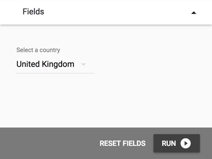
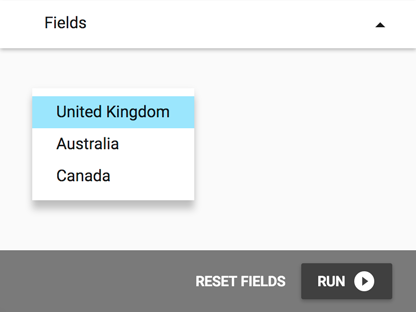
export default function (options) {
	const { Fieldset, Select } = options;

	return new Fieldset({
		fields: [
			new Select({
				name: "country",
				label: "Select a country",
				options: [
					{ label: "United Kingdom", value: "uk" },
					{ label: "Australia", value: "au" },
					{ label: "Canada", value: "ca" },
				],
				value: "uk",
			}),
		],
	});
}
When updating a Select field's state, use selectedValue to set the
current selection.
A select input will look something like the following:
Select dropdown:
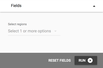
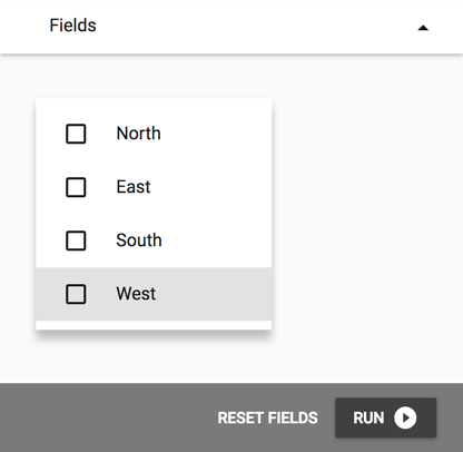
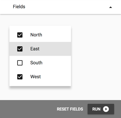
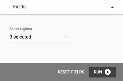
Multi-select example:
export default function (options) {
	const { Fieldset, Select } = options;

	return new Fieldset({
		fields: [
			new Select({
				name: "regions",
				label: "Select regions",
				multiple: true,
				options: [
					{ value: "north", label: "North" },
					{ value: "east", label: "East" },
					{ value: "south", label: "South" },
					{ value: "west", label: "West" },
				],
			}),
		],
	});
}
Default value(s) are not automatically set for multi-selects. If you wish to set one, it needs to be supplied as an array of selected values.
The above multi-select input will look like the following:
Multi-select dropdown:
Selecting multiple options:
Selection complete:
TimePicker
extends BaseField
The DatePicker class is used to pick a time.
export default function (options) {
	const { Fieldset, TimePicker } = options;

	return new Fieldset({
		fields: [
			new TimePicker({
				label: "Time",
				name: "time",
			}),
		],
	});
}

Time picker opens in a modal:

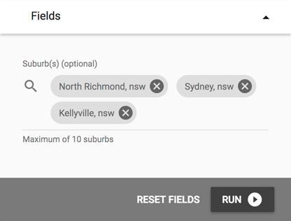
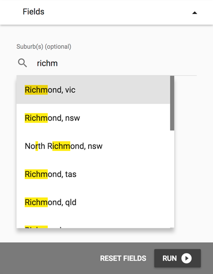
Token
extends BaseField
The Token class corresponds to a tokenised/chip input which can take multiple values, the values can be searched directly or often the result of a network search.
| Parameter | Type | Description |
|---|---|---|
| value | String | Initial value of the input search. Defaults to "" |
| data | Object[] | Available chips in the searchable pool |
| chips | Object[] | Selected chips from the searchable pool. Must match objects available |
| maxChips | Number | The maximum number of tokens allowed to be selected. -1 for infinite, which is the default |
| minimumChars | Number | The minimum characters needed to be entered before results will be shown. Default is 1 |
export default function (options) {
	const { Fieldset, Token } = options;

	return new Fieldset({
		fields: [
			new Token({
				name: "animals",
				label: "Choose an option",
				maxChips: 2,
				minimumChars: 2,
				data: [
					{ label: "Cats", value: "felines" },
					{ label: "Dogs", value: "canines" },
				],
				chips: [{ label: "Dogs", value: "canines" }],
			}),
		],
	});
}
A token input would look something like the following:
Search dropdown:
Selected tokens: